本帖最后由 gaogaofeng 于 2018-2-7 16:33 编辑
很久没有发帖了,大概得有一年了吧,主要还是时间不够,不管是沛版还是上海版,都只能扫扫地,抽空回一下帖子,在此深表惭愧。在家没空玩表,索性把表都搬到办公室,有空还能欣赏欣赏,把玩一下。今天想说的话题,可能大多数表友不太会在意,而我觉得能在一个品牌上看到如此多的样式,非常精彩。那就是----LOGO字体。欣赏一块表的时候,通常都比较关注盘面,指针,刻度,壳型,表带等等,LOGO字体由于相对比较固定统一,所以一般不会有什么变化,也不会引起太多关注。说到“上海”牌,相信大家脑中的LOGO形象无非就是如下图中的,“大厦体”和“毛体”两种。

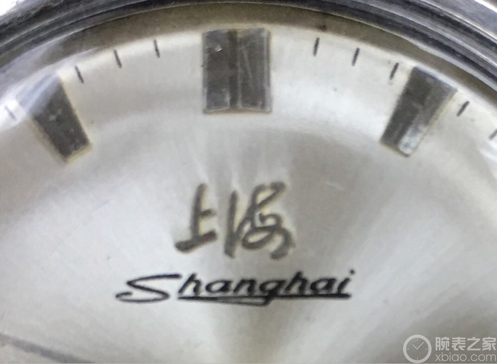
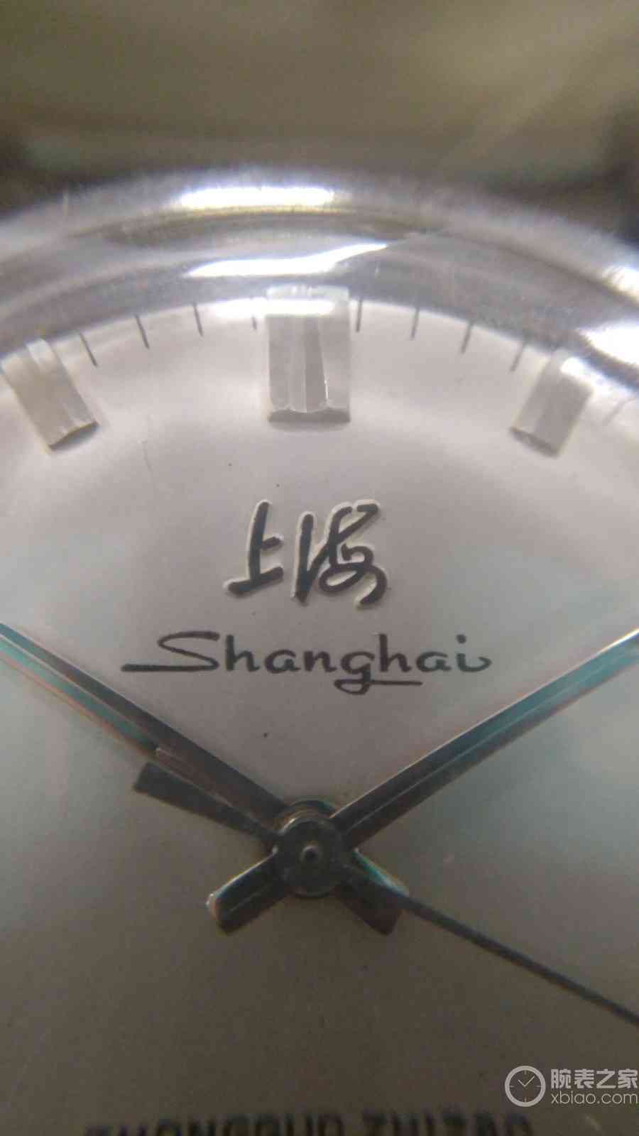
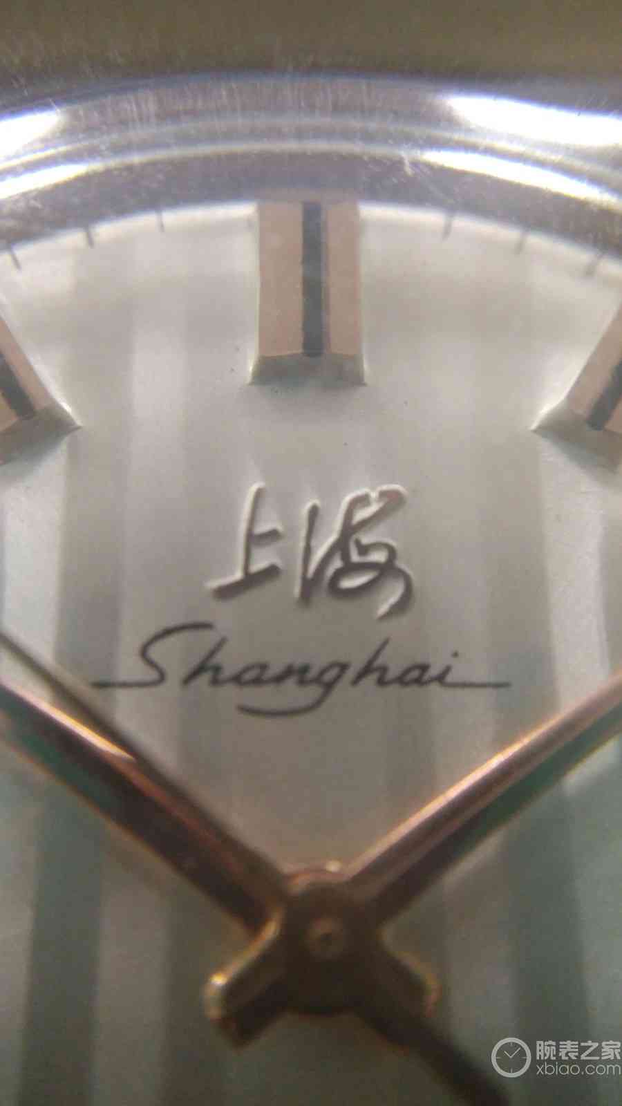
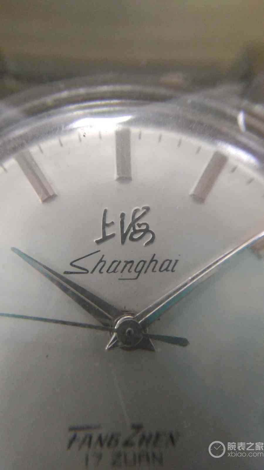
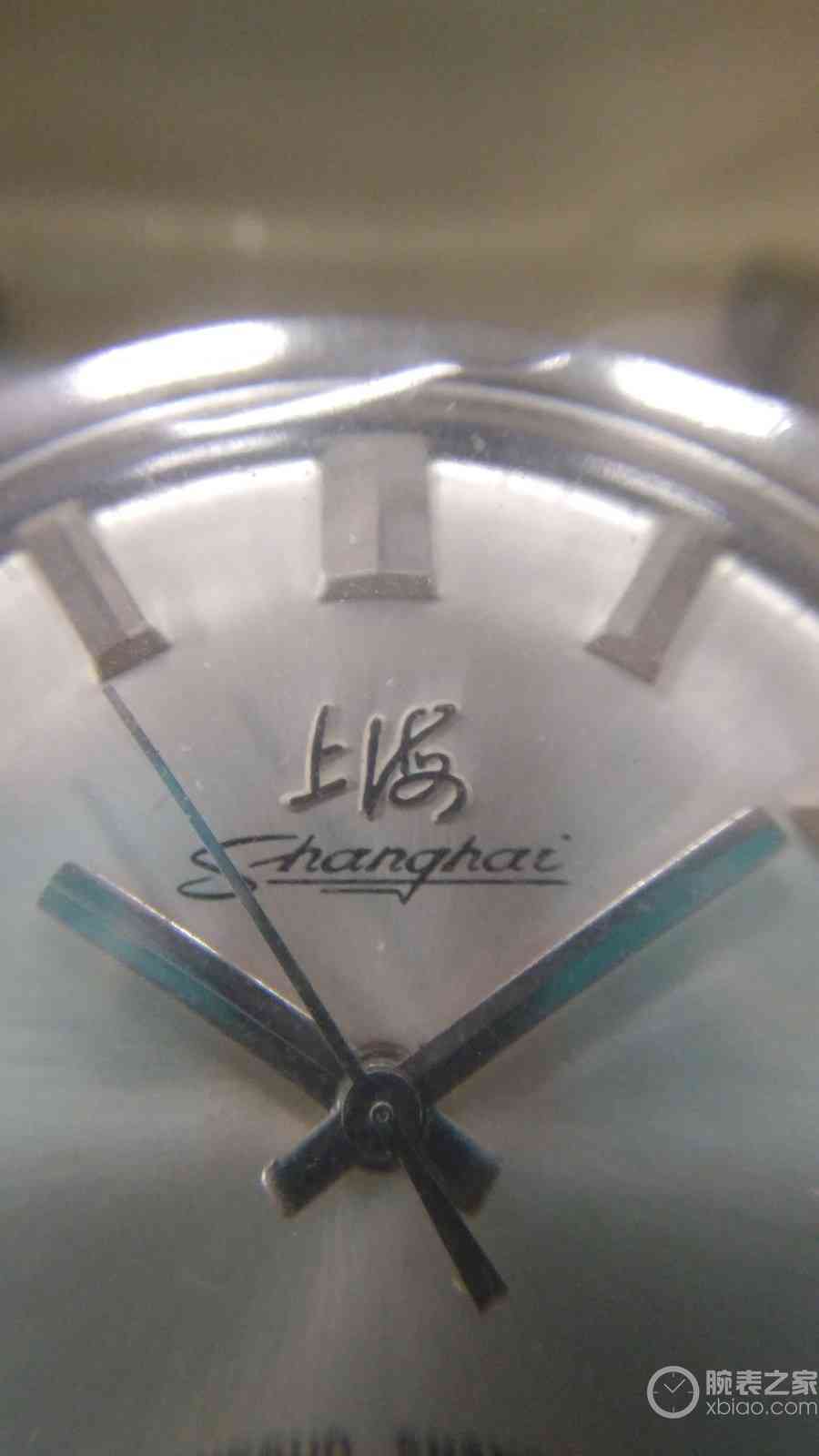
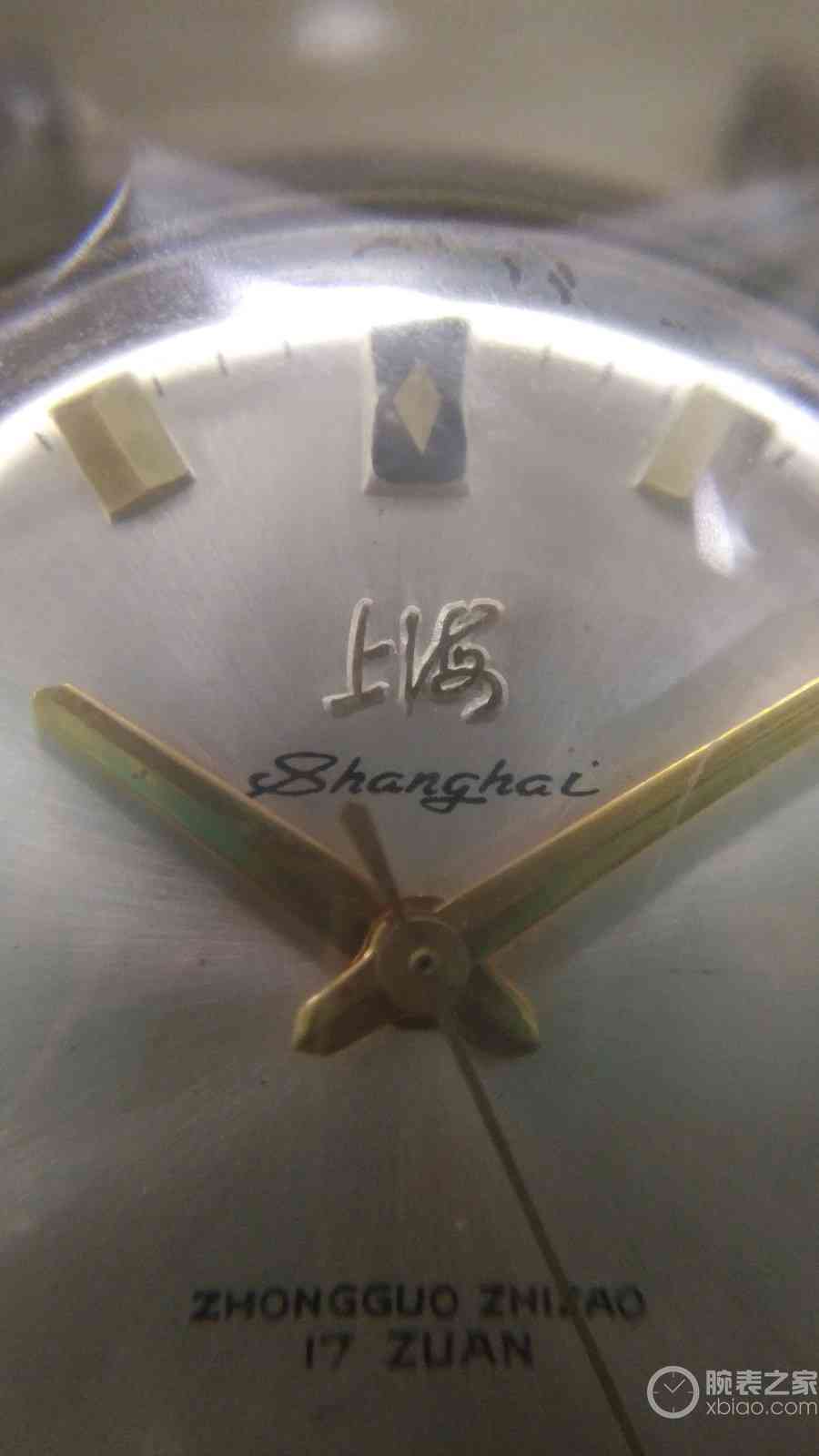
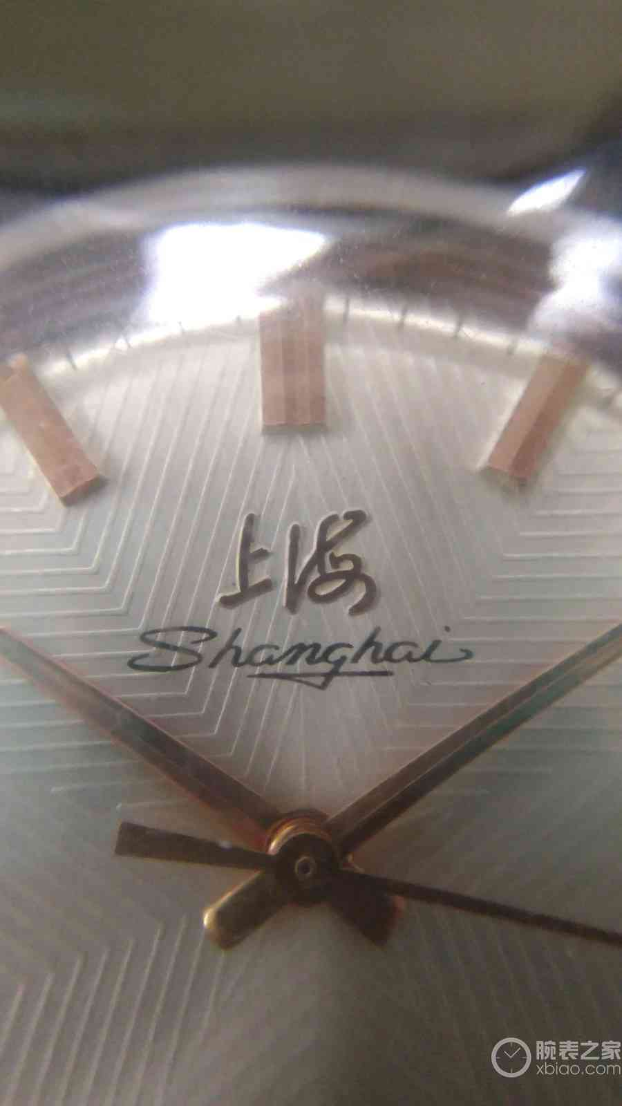
今天所说的字体,并非是LOGO里的中文,而是中文下方的SHANGHAI英文字体。“上海”两字虽然是文字,但作为一个品牌LOGO来说,更多的是一个符号,一个象征,而真正告知大家该品牌名称的,就是下方的英文字。许多品牌在不同时期字体有些小变化非常正常,但是同一时期字体如此多变,估计也很少见吧。。。先来看看最早期的LOGO,大厦体,下方端正的英文字体,不同的是,最早时候是用模具冲压出来,之后改用印刷,比较单一

在1120之后,SS1机芯从慢摆向快摆发展,开始使用毛体。这里说个题外话,其实毛体的“上海”两字前后不同时期也有变化,还有一种LOGO也是书法字,与毛体不同,有人称之为“陈体”,在我的关于早期SS1机芯的帖子里也有提到,这个不展开了,有机会再说说。毛体LOGO下方的英文字的变化开始多起来,一直延续到SS7机芯的后期,从8120开始,基本回归端正的字体,看不到花体了。下面就列举一下目前我所知的花体SHANGHAI字,如各位发现还有不一样的,欢迎补充,万分感谢!我自己按照开头字母“S”的不同,简单地分了一下类:
1.和一般字体相似,两边向中间倾斜,有点像打光的效果

2.几个较普通的花体


3. S上端上翘

4. S上端伸长


5. S弯处比较尖锐,像一个反过来的字母Z


6.一些比较特殊的花体

7. 弯弯的字体,倒过来看像个笑脸


8.几个非常相似的,特点是S的两端都有一个钩,大家可以仔细对比


9.还有一种我自己还没有收到,上次错过一枚

据我自己统计,不同字体就有不下20种。不变的LOGO,多变的字体,感觉和上海这座城市很符合,城市始终在那里,海纳百川而又日新月异。真的非常希望“上海”这个品牌能够一直存在,能够脚踏实地,步步为营,走向成功。